
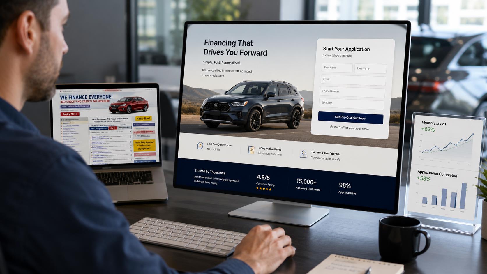
Most dealerships spend real money driving traffic to their auto finance pages — paid search, social ads, organic SEO — and then watch the majority of that traffic bounce without submitting an application. The problem is rarely the traffic source. It’s the page. A weak landing page with a confusing layout, a buried form, or vague messaging will undercut even the strongest lead generation campaign. The best-converting auto finance landing pages follow a specific structure, and once you understand what that structure looks like, the gaps in your current setup become obvious.
This guide breaks down the design, copy, and conversion principles that drive completed applications — not just visits.
TL;DR
- High-converting auto finance landing pages lead with a clear value proposition and a form above the fold.
- Trust signals — lender logos, approval statistics, security badges — reduce friction and lift submission rates.
- Short, multi-step forms consistently outperform long single-page forms for auto loan applications.
- Mobile optimization is non-negotiable — the majority of Canadian auto finance applicants come from mobile devices.
- Want exclusive, pre-screened Canadian auto finance leads without building your own landing page infrastructure? Call Autocarleads at +1-888-510-0264.
AUTOCARLEADS
Skip the Guesswork — Get Leads That Are Already Pre-Screened
Autocarleads delivers exclusive, verified Canadian auto finance leads direct to your dealership — no landing page required.
Why Most Auto Finance Landing Pages Fail Before the First Click
The average auto finance landing page was designed around what’s convenient for the dealership, not what’s compelling for the buyer. You’ll find long application forms that ask for more than a bank would on a first visit, headlines that say nothing beyond “Apply for Auto Financing Today,” and layouts that bury the call to action below three paragraphs of legal-adjacent copy. None of that converts.
Buyers shopping for a car loan are already in a mildly anxious state. They’re unsure if they’ll qualify. They’re wondering whether filling out the form will ding their credit. They’re not sure if they can trust the site. Every element of your landing page either addresses those anxieties or amplifies them. The pages that convert well address them head-on, right at the top.
What the best auto finance landing pages share is a relentless focus on reducing friction and building trust simultaneously. That’s a harder balance to strike than it sounds, because trust-building elements take up space, and too much space means buyers scroll past your form. The disciplines of conversion rate optimization (CRO) and landing page design exist precisely to help you thread that needle, and the auto finance vertical has its own wrinkles that generic CRO advice doesn’t cover.
Getting this right matters more than most dealership managers realize. A landing page that converts at 12% versus one that converts at 6% doesn’t just double your lead volume — it cuts your effective cost-per-lead in half. That’s the math that makes landing page optimization one of the highest-ROI investments a dealership’s digital team can make.
What Belongs Above the Fold on an Auto Finance Landing Page
Above the fold — the portion of the page visible before a user scrolls — is where your conversion rate is mostly determined. If a buyer doesn’t see a reason to stay and a clear path to take action in the first five seconds, most of them won’t scroll. The elements that need to live above the fold are specific: a clear headline, a subheadline that handles the most common objection, a form or the start of a form, and at least one trust signal.
Your headline should answer the question every auto finance buyer has when they land: “Can I get approved?” or “Is this worth my time?” Headlines like “Get Approved for a Car Loan in 60 Seconds” or “Bad Credit or Good — See Your Options Without Affecting Your Score” do real work. They address the anxiety, make a promise, and tell the buyer exactly what happens when they click. Generic headlines like “Auto Financing Solutions” do none of that.
The subheadline is your second chance. It’s where you neutralize the biggest objection — which, in auto finance, is almost always either credit concern or distrust of the process. Something like “No hard credit pull on your first inquiry. No obligation. Results in under a minute.” handles both in one sentence. That’s not puffery; it’s a specific reassurance that directly addresses what stops buyers from submitting.
The form or form-start belongs above the fold, not below it. In auto finance, this typically means showing the first step of a multi-step form — something as simple as “What’s your approximate credit situation?” with a few radio buttons. That first micro-commitment dramatically increases the odds of completion. Once a buyer has clicked one option, they’re invested.
The Case for Multi-Step Forms Over Long Single-Page Forms
A single-page auto loan application that asks for income, employment status, co-applicant details, vehicle preference, and contact information all at once is asking for a lot of trust from someone who just landed on your page 30 seconds ago. Multi-step forms break that same information into smaller, lower-friction moments — and the conversion data consistently shows they outperform single-page forms in auto finance contexts.
The psychology here is well-documented. When a buyer fills out Step 1, they’ve made a small commitment. When Step 2 appears, they feel invested enough to continue. By the time they reach Step 3, where you collect their contact information, they’re already mentally mid-application. Abandonment drops at each step because each completed step raises the psychological cost of leaving. Contrast that with the single-page form, where every unfilled field is a visible reminder of how much is left.
💡 DID YOU KNOW:
Multi-step forms can increase conversion rates by 86% compared to single-step forms, according to data from Leadpages’ conversion benchmark study. In high-consideration categories like auto finance, where buyer anxiety is elevated, the effect is even more pronounced.
Source: Leadpages Conversion Benchmark Report, leadpages.com.
The optimal step count for an auto finance form is three. Step 1 collects vehicle or loan intent (what are you looking for, rough credit range). Step 2 collects financial context (approximate income, employment status). Step 3 collects contact information and confirms consent. That sequence works because it leads with the least threatening questions and saves the personal information for last, when the buyer is already committed.
Progress indicators — a simple “Step 2 of 3” display or a progress bar — reduce abandonment further by giving buyers a visible sense of how close they are to finishing. This is a small UX detail that high-converting finance pages almost always include. It costs nothing to implement and consistently lifts completion rates.
Trust Signals That Actually Move the Needle in Auto Finance
Trust signals on an auto finance landing page serve a specific purpose: they answer the buyer’s implicit question of “Is this legitimate, and is my information safe?” The wrong trust signals — generic lock icons, vague “We value your privacy” statements — are so common they’ve become invisible. The right trust signals are specific and credible.
Lender logos are among the most powerful trust signals available to a dealership or finance platform. When a buyer sees logos from recognizable Canadian lenders — TD Auto Finance, Scotiabank, RBC, or alternative lenders like iA Financial — it signals that real financial institutions have vetted this process. It also communicates network breadth: this page can get you approved even if one lender says no. That’s a meaningful promise for any credit-challenged buyer.
Application volume and approval statistics work because they’re specific. “Over 180,000 Canadians have applied” carries credibility that “Thousands of approvals” doesn’t. Round numbers feel made up. Specific, large numbers feel earned. If your platform or lead source has real processed-application volume, put it on the page with the number.
Privacy and credit inquiry disclosures belong near the form submit button, not buried in the footer. The two things that reliably stop buyers from submitting are credit score fear and data privacy concern. Address them directly: “Checking your options here does not affect your credit score” and “Your information is never sold or shared” — next to the form, above the button, in plain language.
“A buyer who doesn’t trust your landing page will never trust your finance office. Earn the click before you ask for the application.”
Mobile Optimization Is Not Optional
Canadian auto finance buyers increasingly search and apply from mobile devices. Any landing page that isn’t built mobile-first — not mobile-responsive as an afterthought, but designed for a 390-pixel viewport from the ground up — is losing a significant portion of its potential applications before they start.
Mobile optimization in auto finance has specific requirements. Tap targets need to be large enough to select without zooming. Form fields need to trigger the right keyboard (numeric for income and phone fields, email-type for email fields). The form should not require horizontal scrolling. The CTA button should be thumb-reachable on standard phone sizes, meaning it needs to appear low enough on screen to be accessible without repositioning the hand.
AUTOCARLEADS
Your Dealership Deserves Leads That Are Ready to Buy
Autocarleads handles all the landing page infrastructure, QA screening, and AI-powered follow-up — you just receive exclusive, pre-verified Canadian auto finance leads with income confirmed at $1,800/month minimum.
- ✓ 100% exclusive — never shared with competing dealers
- ✓ Geo-targeted to your territory across Canada
- ✓ Lead buyback guarantee and no long-term contracts
Or call +1-888-510-0264
Page load speed is also a mobile conversion factor, not just a technical metric. A landing page that takes more than three seconds to load on a mobile connection will lose a measurable percentage of visitors before the page finishes rendering. Compress images, minimize redirects, and avoid heavy JavaScript frameworks on pages where every millisecond of load time costs conversions.
Testing your landing page on an actual mobile device — not just a browser simulation — is the only reliable way to catch mobile UX problems. Things like autocomplete behavior on form fields, keyboard overlay obscuring the submit button, and tap-to-call functionality on phone number trust signals are all issues that only surface on real hardware.
Copy Principles That Drive Applications in the Canadian Market
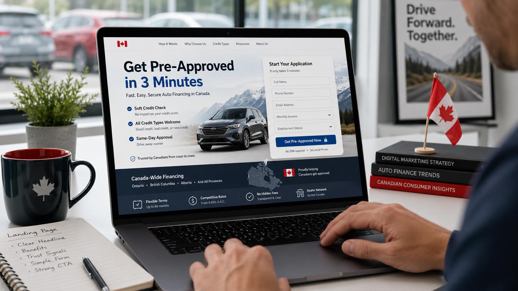
Auto finance landing page copy in Canada has to navigate a specific set of buyer concerns that differ from the US market. Canadian buyers are acutely aware of credit bureau inquiries. They’re familiar with the distinction between hard and soft pulls, and many have been burned by applications that triggered a hard inquiry without producing an approval. Any landing page copy that doesn’t address this will lose the segment of buyers who’ve had that experience.
The most effective headline frameworks for Canadian auto finance pages are approval-oriented (“Get Pre-Approved in 3 Minutes”), credit-inclusive (“All Credit Types Welcome — Including Bad Credit and No Credit”), and speed-focused (“Same-Day Approval Decisions Across Ontario, BC, Alberta, and Beyond”). These work because they directly address the hesitations buyers bring to the page. They’re not clever — they’re clear, and in finance, clarity converts better than cleverness.
Body copy should be minimal on a landing page. This is not an article or a guide. Buyers are not there to read; they’re there to decide whether to apply. Use short sentences, bullets over paragraphs, and bold the two or three phrases that carry the most weight. The goal of every line of copy on a landing page is to remove one more reason not to submit the form.
Urgency language in auto finance has to be earned, not manufactured. “Apply now” is fine. “Apply before midnight or lose your rate” is manipulative and Canadian buyers recognize it immediately. Genuine urgency can come from real scarcity — a limited number of lender spots in a given territory, a promotional rate window — but it needs to be true. False urgency in finance damages trust the moment it’s perceived as fake, and it will be.
What Happens After the Application: The Follow-Up Problem
The landing page is only the first half of the conversion. What happens in the minutes and hours after a buyer submits an application determines whether a lead becomes a sale. The research on speed-to-lead in auto finance is unambiguous: buyers who are contacted within five minutes of submitting an application are dramatically more likely to convert than those contacted after an hour.
Most dealerships are not staffed to respond to leads in five minutes, especially outside business hours. This is where AI-powered SMS follow-up changes the math entirely. An automated SMS sent within seconds of form submission keeps the buyer engaged, confirms their inquiry was received, and sets the expectation of a call — all before a human has even seen the lead notification. The buyer who fills out a form at 9:47 PM on a Thursday is not going to wait until Friday morning for a response. If you don’t follow up instantly, your competitor will.
|
150+
Canadian dealerships receiving Autocarleads leads
|
180,000+
Auto finance applications processed
|
6–15%
Dealer conversion rate on leads
|
The landing page should be built with this follow-up reality in mind. That means collecting a mobile number as a required field — not optional — and using form microcopy that sets the expectation of a call or text: “A finance specialist will contact you within minutes.” When buyers know what comes next, they’re less likely to ignore the incoming call from a number they don’t recognize.
Testing Your Landing Page: What to Measure and When
Landing page optimization is not a one-time project. The pages that consistently convert at 10% or higher are pages that have been tested, iterated, and improved over dozens of small changes. But testing without a framework produces noise, not insight. The metrics that matter in auto finance landing page optimization are specific and sequential.
Start with bounce rate. If more than 60% of visitors are leaving without interacting with anything on the page, the problem is above the fold — your headline, your hero section, or your page load speed. Fix that before testing anything else, because all downstream metrics are distorted by a high bounce rate.
Once bounce rate is under control, look at form start rate — the percentage of visitors who interact with the form at all. A low form start rate usually signals a trust problem or a friction problem in the early form fields. Then look at form completion rate — of those who start the form, how many finish it? Drop-off by step in a multi-step form will tell you exactly which question is causing abandonment.
Run A/B tests on one element at a time: headline copy, hero image versus no hero image, number of form steps, color and text of the submit button, placement of trust signals relative to the form. Clean test methodology — one variable, sufficient sample size, statistical significance before declaring a winner — produces actionable insights. Testing too many variables at once tells you something changed but not what.
Key Takeaways
- Put your value proposition, an objection-handling subheadline, and the first step of your form above the fold — that’s where conversion rates are determined.
- Switch to a multi-step form with a progress indicator; three steps is the proven optimal structure for auto finance applications.
- Place specific trust signals — lender logos, processed application volume, credit inquiry disclosures — directly adjacent to your form, not in the footer.
- Test your page on a real mobile device and confirm load speed is under three seconds on a standard LTE connection.
- Build your follow-up infrastructure before you optimize for more applications — a page that converts at 12% with poor follow-up will still lose to one that converts at 8% with a five-minute AI SMS response.
Frequently Asked Questions
What should be on an auto finance landing page above the fold?
Above the fold on an auto finance landing page should include a headline that addresses buyer approval anxiety, a subheadline that handles the most common objection (usually credit concern or data privacy), the beginning of your application form, and at least one specific trust signal such as a lender logo or approval volume statistic. These elements give the buyer an immediate reason to stay and a clear next step to take within the first five seconds on the page.
Do multi-step forms really convert better than single-page forms for auto loans?
Yes, consistently. Multi-step forms reduce the perceived commitment of each interaction by presenting one or two questions at a time rather than a full application at once. In auto finance, where buyer anxiety around credit and data is elevated, this staged approach dramatically reduces abandonment. The optimal structure for a Canadian auto finance multi-step form is three steps: loan intent and credit range first, financial context second, and contact information last.
What trust signals work best on Canadian auto finance landing pages?
The most effective trust signals for Canadian auto finance landing pages are lender logos from recognizable institutions, specific application volume statistics (e.g., “180,000+ applications processed”), explicit credit inquiry disclosures placed near the form submit button, and privacy statements in plain language. Generic trust badges and lock icons have become too common to carry real credibility — specificity is what distinguishes effective trust signals from noise.
How important is mobile optimization for auto finance landing pages?
Critical. The majority of Canadian auto finance inquiries originate from mobile devices, and a page that isn’t designed for a 390-pixel viewport will lose a significant share of its potential applicants before they start. Mobile optimization for auto finance specifically means large tap targets, correct keyboard types for each form field, a thumb-reachable CTA button, and a load time under three seconds on a standard LTE connection. Testing on a real mobile device rather than a browser simulation is the only reliable way to catch issues.
How quickly should a dealership follow up with a submitted auto finance application?
Within five minutes, at a minimum, and ideally within seconds using automated AI SMS. Research consistently shows that contact rates and conversion rates drop sharply after the first five minutes following form submission. Buyers are engaged and expecting contact in that window — after that, they’ve moved on, their attention has shifted, or a competitor has already reached them. Dealerships receiving leads outside business hours should have automated follow-up in place to bridge the gap until a human can call.
What metrics should I track to optimize my auto finance landing page?
Track bounce rate first — if it’s above 60%, the above-the-fold section needs work before you optimize anything downstream. Then track form start rate (percentage of visitors who interact with the form at all), form completion rate (percentage of form starters who finish), and step-level abandonment in multi-step forms to identify exactly where buyers drop off. Once those are stable, run A/B tests on individual elements: headline copy, trust signal placement, CTA button text, and form field order.
AUTOCARLEADS
Let Us Handle the Landing Page. You Focus on Closing Deals.
Autocarleads delivers 100% exclusive, pre-screened Canadian auto finance leads with income verified at $1,800/month minimum — backed by AI SMS follow-up within 5 minutes and a full lead buyback guarantee. No landing page infrastructure required on your end.
- ✅ 100% exclusive leads — never shared or recycled
- ✅ Lead buyback guarantee on unqualified leads
- ✅ No long-term contracts — scale up or down as needed
- ✅ Geo-targeted to your territory anywhere in Canada
📞 Call +1-888-510-0264 to start filling your sales floor with qualified Canadian buyers.